
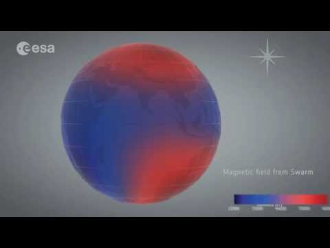
Lithospheric magnetic field
After three years of collecting data, the highest resolution map of Earth’s lithospheric magnetic field from space to date has been released. The dataset combines measurements from ESA’s Swarm satellites with historical data from the German CHAMP satellite using a new modelling technique that allowed scientists to extract tiny magnetic signals from Earth’s outer layer. Red represents areas where the lithospheric magnetic field is positive, while blues show areas where it is negative.
Read full article: http://www.esa.int/Our_Activities/Observing_the_Earth/Swarm/Unravelling_Earth_s_magnetic_field
Credits: ESA/DTU Space/DLR


Yay. First to comment 😀😀
So each anomaly, positive or negative, reflects ancient or present-day processes that have altered the magnetization of the lithosphere.
Thus the evenness in the Oceans and the greatest disturbances on land and near Ports.
Is there a reason for the highest values being on land?
I may have seen this wrong lol
are there big sparks in europe ?
wha does the European Space Agency didn't show Europe more closer?
can somebody explain this to me? why does north america have so many peaks and south east asia is closer to zero?
Epic Fail! There should have been a proper narration explaining this.
It would be great if all those 3d models were available to the public to see it in deep.
Its a great map -but slow the pay back speed down to get more out of it! Plus – I wish they would also produce a flat map projection so it cold be examined more closely. I managed to find an "anomalous" hot spot in what appears to be a w/central pat of Africa with a stone circle on it!